“It’s the Space Between the Counters that Counts”
We’ve all been stuck in that kitchen, probably shoulder to shoulder with at least a dozen house guests, unable to move; unable to get out. It could be a bottle neck in the galley kitchen or the out-of-place peninsula that creates a flashback of long lines at Disneyland. Its an agoraphobic’s nightmare and if it’s your house it might be enough for you to avoid hosting another party. From someone who sees all of the great potential of a well designed kitchen this scenario is a major reason to allow for the flow of traffic in your new kitchen layout.
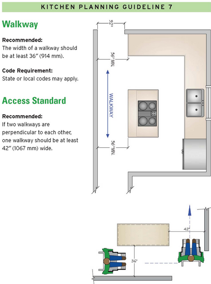
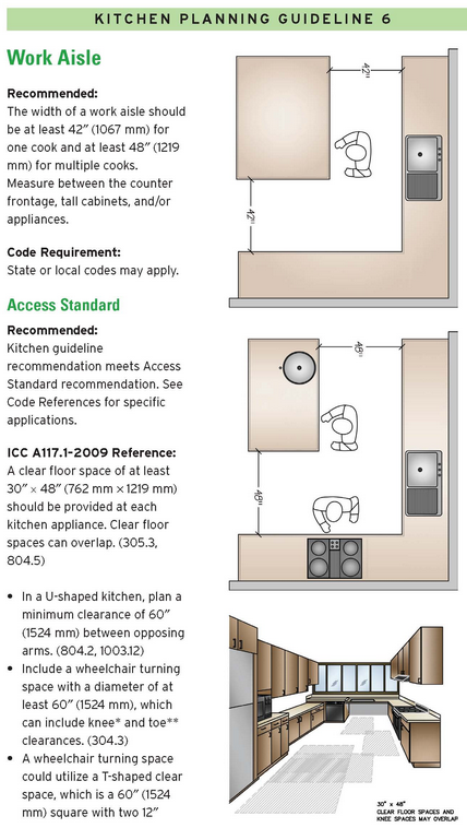
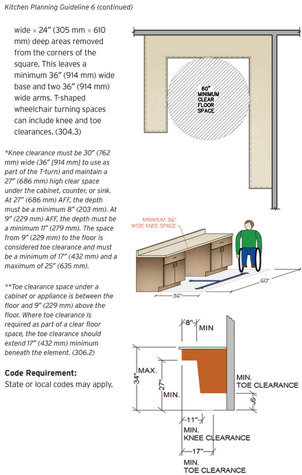
You will notice in the diagrams that there are a variety of traffic patterns to account for in a modern kitchen. Is there going to be more than one person preparing meals? Do you entertain large parties? Are you accounting for the needs of a person using a wheel chair? These are all good questions to consider prior to laying out the floor plan of your kitchen.
Regardless of the square footage a good floor plan will allow for people to move comfortably through its space. My rule of thumb is to keep a minimum of 42″ between counter edges. This magic number is a good rule to allow two people to easily navigate in the work aisles of the kitchen without having to bear hug on the way by.  The counter-to-counter work space should not be confused with a general walkway in which the flow of traffic can pass through the kitchen freely while bypassing the work aisles. The minimum width of the walkway should be 36″ (more space is always better if possible).
If you are having a hard time visualizing this new space, use some props such as furniture or stacked boxes to simulate countertops. Have 1 or 2 other people pass through the space and try to imagine preparing meals or doing the dishes within that space. After doing this you might find that 44″ or 46″ is going to be the ideal counter to counter space.
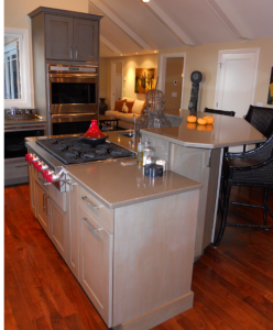
Over the years I have had many clients who want to either modify or add an island to their kitchen. My response is usually: “Great!” I love what an island can bring to a kitchen ascetically and functionally. In the design phase I compare the idea of an island to a ball of clay that has to be shaped and pulled, larger or smaller, initially depending on the the available counter-to-counter space. Leaving enough space is critical but often times there is too much space unused in which I will insist on enlarging the island with more cabinets, a breakfast bar, or shelves. Clients have used the added countertop space to incorporate a prep sink, cooktop, or a butcher block into the larger island.
The depth of the base cabinets at the perimeter walls of the kitchen typically measures 24″ (approximately 25-1/4″ with a countertop overhang). This measurement combined with the desired walkways and counter-to-counter space will allow you to see what space is left for a realistic island or peninsula. Many times I use this formula and determine that a permanent island is not the best choice for the kitchen and we look to explore other options for a useful countertop workspace. Rollaway islands or counter bump outs have been unique solutions that have not taken away from the kitchen’s minimum rule of 42″ of counter-to-counter space.
The images and diagrams are courtesy of the National Kitchen and Bath Association
Look for our next post when we’ll introduce Design Guideline #4 “In the Kitchen- Leave Enough Space to Park It”


